

Designing Form Validation Messages People Can Act On
A useful validation message identifies the field, explains the issue and guides a correction while preserving the user's work.

A user completes a form, presses the button and receives “invalid data”. They do not know which field needs attention or whether every entry must be repeated. Such a message leaves the diagnosis to the user. Helpful validation connects an issue to the appropriate field, explains which requirement has not been met and offers an action the user can take without guessing.
Begin with rules that are actually needed
Before writing messages, examine why each rule exists. Is a field required to continue the process? Does the receiving system need a particular format? A rule without a clear purpose can make the form harder to use. Do not restrict names or user choices merely because another form does so without examining the business requirement.
Separate compulsory information from optional information. If additional notes may be empty, skipping them should not create an error. When a restriction is necessary, explain it before the user discovers it through failure. Validation wording becomes easier to design when the process owner and developer have already agreed on the underlying rules.
Identify where the correction belongs
Put the message near the relevant field and use the same name as its label. “Check the email address” is more helpful than “contact-data error” when several contact fields exist. For a lengthy form, an error summary can help people find the affected sections, with clear connections to the individual fields.
Do not rely solely on a red colour or a small icon. Users need information that makes sense without interpreting colour. Status information available through assistive technology should also be tested in the implementation. In the content brief, record the field label, message wording and trigger so those requirements survive the design process.
Explain the issue and next step
Compare two messages for an incomplete example email entry:
| Message | What the user learns |
|---|---|
| Incorrect data | No location or correction is identified |
| Complete the part after @ in the email address | The part requiring attention is identified |
This example is not a universal rule for every email error. Wording should match the check that was actually performed. Do not say an address is inactive when the application only checks its format. Also avoid blaming the user when a failure belongs to the sending service or network.
Use language understandable without internal technical terminology. An error code can support troubleshooting, but it should not be the only explanation. Users need an action such as correcting a field, trying again or contacting an appropriate channel when one is available.
Keep the entry and guide the correction
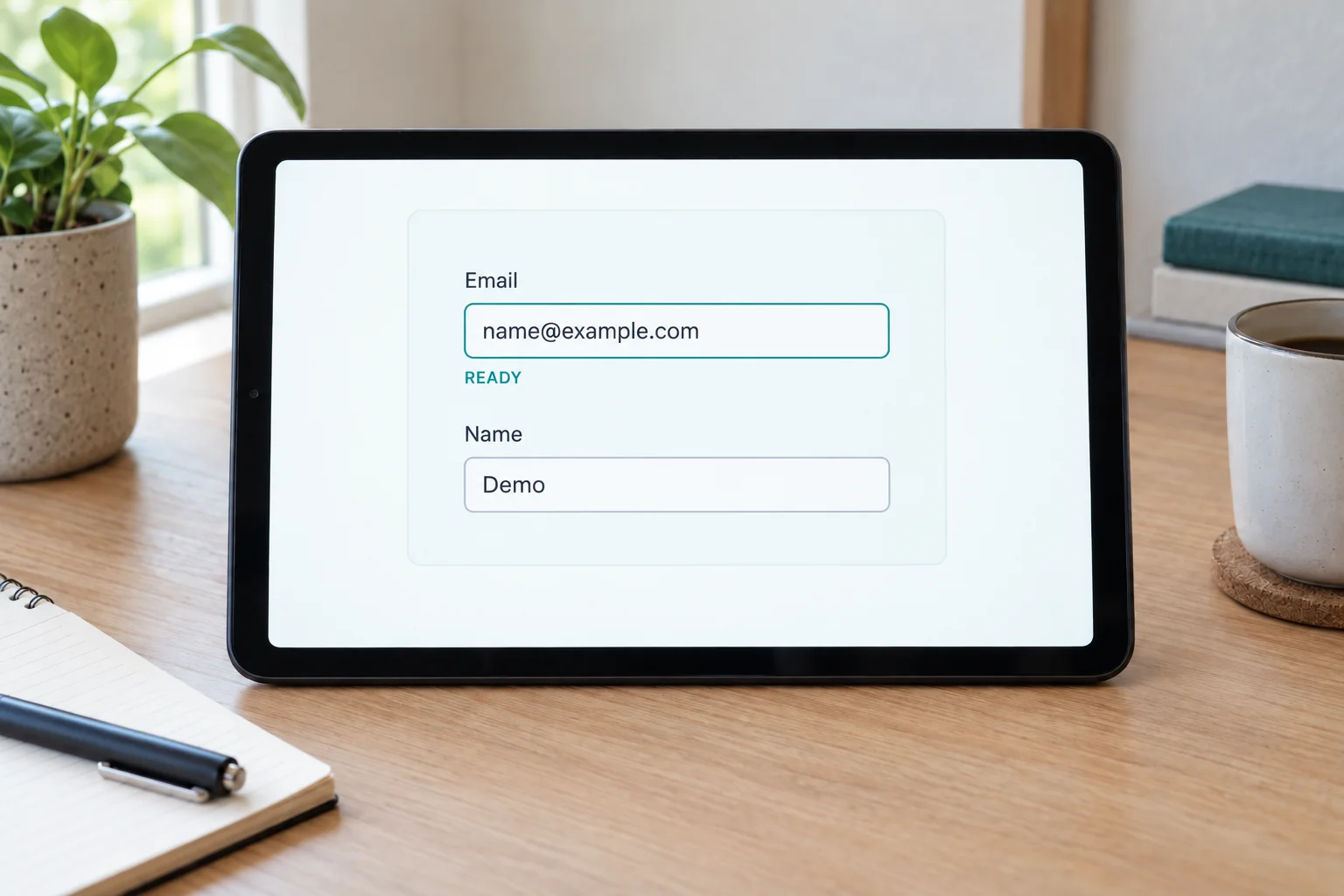
When one field needs attention, preserve other entries where this fits the application’s security requirements. Do not clear the entire form and make people repeat work that has no problem. Show the value being checked so they can see the missing part, then guide their attention to the appropriate place.
The image’s email example changes from an incomplete entry to a complete-looking format while the name remains present. This shows the relationship between feedback and action. Sensitive information may have different handling rules that need deliberate decisions. The aim is to preserve the user’s working context with rules suited to the information being processed.
Choose an appropriate moment for feedback
Feedback arriving too early can interrupt someone who is still typing. Feedback arriving too late can send them far back up a form after submission. Decide when a check is needed: after leaving the field, on submission or at a particular step. Use realistic scenarios rather than assuming that every field needs identical behaviour.
For a multistep form, explain errors in the context of the relevant step. Users should not receive an error about a section they have not seen. If server-side information changes after an entry was prepared, explain that the latest state needs review. This differs from a typing error and needs different wording.
Align messages with server-side checks
MDN explains that browser validation does not replace validation at the server. OWASP also treats input checks as application controls. Interface messages should agree with the receiving service’s result rather than present contradictory answers to the user.
Try a few short stories: an empty field, an incomplete format, a valid entry and a service that does not respond. Read the messages without developer notes. If the next action remains difficult to explain, revise the wording or its underlying rule. For a web-app form discussion, use Creatyf’s information and related articles. Include example messages and the entries that trigger them so the discussion begins with concrete situations.
Official sources
Build
Continue with related guides.

Preparing a Business Website Project
A practical guide to aligning goals, users, content, ownership, scope, and operational readiness before a business website project begins.

Websites, Web Apps, or Mobile Apps
A decision framework for choosing a website, web app, or mobile app based on user tasks, device capabilities, data, distribution, and operating cost.

From Business Goal to an Actionable Digital Brief
How to connect a business problem, user needs, scope, constraints, evidence, and project decisions in one actionable brief.