

Web App Filters: Reset Controls, Active States and Empty Results
Explain empty filtered results through active constraints, clear reset behaviour, loading states and cause-specific next actions.

An empty list in a business web app may mean there is no data yet, no record matches the selected filters, or loading failed. Those states need different messages and next actions. Resetting filters helps with an overly narrow selection, but does not repair a failed connection or an unsuccessful request.
Design search around the user’s task: finding one order, reviewing a status or checking a date range. People need to see the active constraints before they can understand why a list has narrowed to zero.
Distinguish three reasons for an empty list
Consider an order list. A new team with no orders needs a starting action. A team with orders but an unmatched filter combination needs a way to change its constraints. A loading failure needs an explanation and an appropriate retry route.
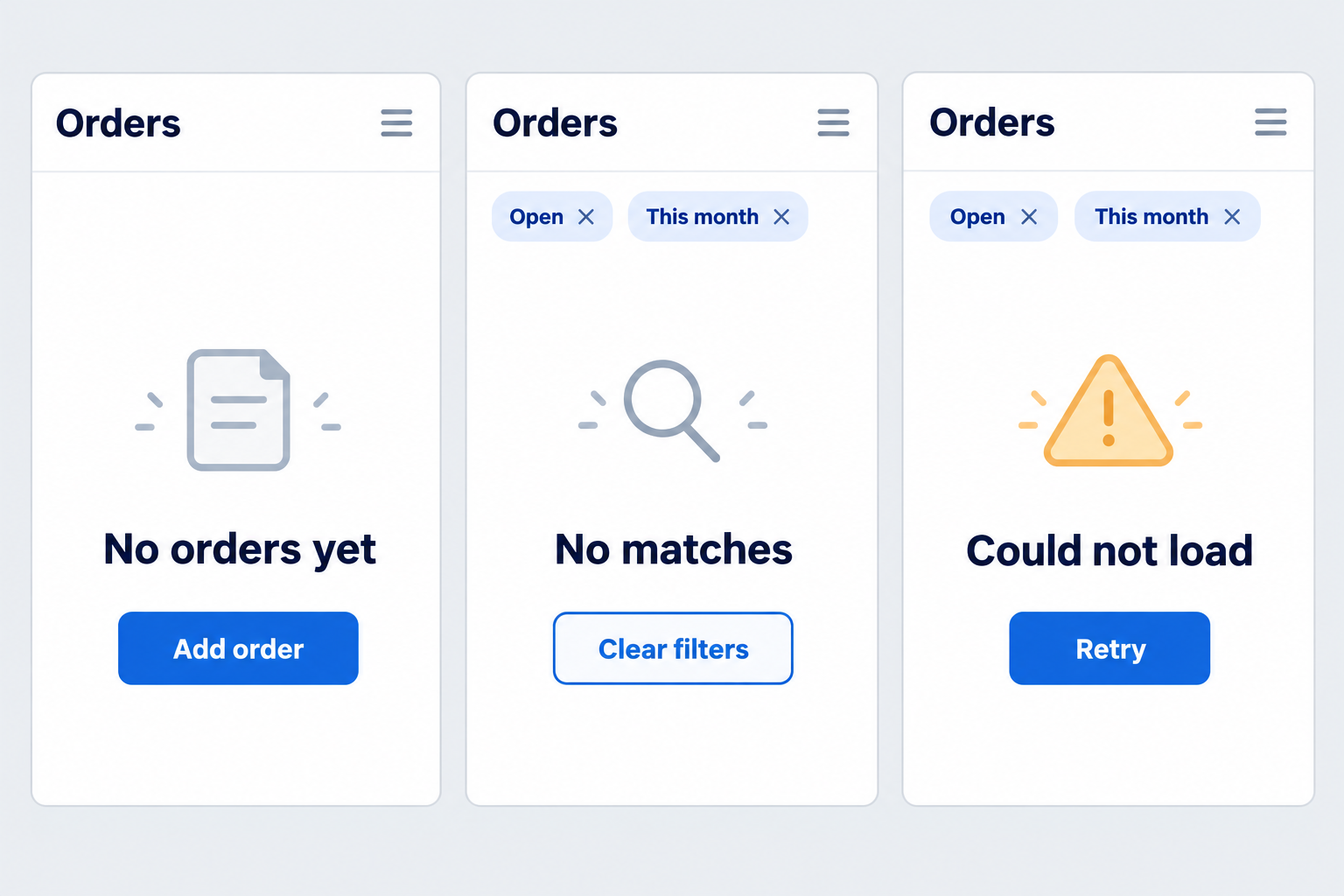
| State | Helpful message | Next action |
|---|---|---|
| No records yet | No orders have been created in this workspace | Create an order if authorised |
| No filter matches | No results match the selected constraints | Change or clear the filters |
| Loading failed | The list could not be loaded | Retry without losing completed selections |
These are design examples, not mandatory wording for every application. Match the language to real work. Avoid implying that data has disappeared when the system has not yet received a trustworthy result.
Show the filters that are actually active
Constraints may include status, dates, branch, search text or previously saved choices. Display a summary near the results. Users should not have to reopen a hidden panel merely to discover what is restricting the list.
Visa Product Design System includes active-filter indicators and removal controls. The practical principle is to make the current state readable rather than require memory of selections from an earlier session.
Explain default filters too. “This month” differs from “all time”. No results within a short period do not establish that a customer, order or product has never existed. A visible date range can prevent an unnecessary support conversation.
Define reset and clear
Reset may mean returning to defaults, while clear may mean removing additional selections. Choose labels that describe the implemented behaviour. Avoid two differently named controls with identical effects unless there is a reason users can understand.
Infor’s search and filter guidance also considers clear interactions. In a brief, describe the outcome directly: “Return to the user’s branch and current month” or “Remove all filters the user can change.”
Access boundaries remain in place after clearing filters. A user authorised for one branch does not gain every branch. Separate adjustable search constraints from the permissions imposed by the system.
Keep selections connected to their results
If filters require an Apply button, distinguish newly changed controls from the selections that produced the displayed list. Users should not assume a result follows a new date range when that change has not been applied.
For automatic updates, provide an understandable loading state. Do not briefly show zero results as a final answer while a request is still running. If loading fails, retain the selections so the user need not rebuild the search.
Clarify combination rules as well. Does selecting two statuses mean either status or both simultaneously? Does a date range include its final day? Write rules that can be checked with examples instead of leaving meaning to the control’s visual appearance.
Test with explainable data
Prepare records with known results. Try one filter, a two-filter combination, a range with no matches and a return to the initial state. Compare the active summary with the list after every step.
Include opening a detail and returning to the list. Somebody checking orders should not lose context without explanation. Preserve state when that serves the task, or explain a reset that is an intentional product decision.
Also check keyboard use and relevant assistive-technology announcements. A message needs to work when a colour change or picture cannot be perceived. The essential information is why the list is empty and which actions are available.
Record the expected outcome for each example, including the filters remaining after reset. This gives the team a repeatable reference when another category or a saved-search feature is added later, rather than relying on screenshots alone.
For example, a colleague selects branch A and completed orders, then moves the date to a month without transactions. The message should connect the empty result to those choices rather than suggest creating a new order. Restoring the date should bring back the known results without silently changing the branch boundary.
For moving through results, see pagination or infinite scroll. When planning with Creatyf, bring searches that regularly confuse your team. Useful filtering explains the result and offers a way forward when nothing matches.
Official sources
Build
Continue with related guides.

Preparing a Business Website Project
A practical guide to aligning goals, users, content, ownership, scope, and operational readiness before a business website project begins.

Websites, Web Apps, or Mobile Apps
A decision framework for choosing a website, web app, or mobile app based on user tasks, device capabilities, data, distribution, and operating cost.

From Business Goal to an Actionable Digital Brief
How to connect a business problem, user needs, scope, constraints, evidence, and project decisions in one actionable brief.